|
Complementary Color Text & Photography © Ron Day Color is powerful. It is linked to our behavior and emotions, and tests have shown it affects the subconscious mind. The careful use of color in photography can add impact and create exquisite images. Red, yellow and blue are the primary colors. All other colors are a mixture of these. The secondary colors — green, purple and orange — are each made with equal parts of two primary colors. On the Wheel of Colors, secondary colors lying opposite of primary colors are referred to as complementary, because of the unusual visual effect created when the two colors are placed together.
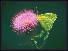
A smaller dose of red, yellow, or orange used in conjunction with a larger volume of green, purple, or blue, respectively, seems to amplify the effect. An orange butterfly looks terrific against a blue sky. A purple thistle blossom visited by a yellow Sulphur butterfly just seems to glow. And, small red berries on lush green foliage create stunning Christmas images each year.
|